


Chocolate has weaved its way into our cultural fabric. This popular snack is enjoyed by young and old alike.
Having a sweet tooth myself, I decided to analyze the ratings of chocolates to understand what exactly makes them tick. Is it based on the manufacturer? Or is it the Cocoa Percentage? Or something else?
Lets delve deep into this problem using Tableau.
About The Dataset:
I have used the following dataset from Kaggle:
https://www.kaggle.com/datasets/andrewmvd/chocolate-ratings?select=chocolate_ratings.csv
The columns are :
REF (or the ID of the chocolate)
Company (Manufacturer of the chocolate)
Company Location
Review Date
Country of Bean Origin
Specific Bean Origin or Bar Name
Cocoa Percent
Ingredients
Most Memorable Characteristics
Rating
Data Preparation:
I created a calculate field of "Cocoa Percentage" from "Cocoa Percent" Attribute by multiplying Cocoa Percent with 100 to bring the attribute in percentage form.
I changed the geographic role of Company Location to "Country/Region" since it was initially given in text format.
Analyzing the Manufacturers in the Chocolate Industry:
Top 10 Most Popular Chocolate Manufacturers:

I began the analysis by taking the count of records as columns and company i.e. manufacturer as rows
Then I applied a filter to get the Top 10 most popular manufacturers or those manufacturers who occur the most number of times in the table.
Analyzing the Prominent Cocoa Percentages:

To create this line chart, I took the Cocoa Percentage attribute as columns and count of records as rows.
Then I added a dropdown filter for the Company(Manufacturer) so that the graph is adjusted accordingly whenever I choose a particular company.
Analyzing the Trends in Ratings:

In order to make this line chart, I took the Rating attribute as columns and the count of records as rows.
Then I added a dropdown filter for the Company(Manufacturer) so that the graph is adjusted accordingly whenever I choose a particular company.
Average Rating of the Manufacturer:

In order to get this metric, I considered the average rating as "Text" and added a Company(Manufacturer) filter so that the value in the text box changes for each company chosen.
Total Number of Manufacturers:

To get this metric, I took the distinct count of manufacturers as "Text".
Dashboard:
To combine all the information pertaining to the manufacturers in the chocolate industry, I created the following dashboard:

Inference from this Dashboard:
Soma is the most popular chocolate manufacturer
Majority of the chocolates have 70% of cocoa percentage
A vast amount of chocolates have a rating of 3.5 followed by 3.0
The average rating of manufacturers is 3.196
Analyzing the Countries Involved in the Chocolate Industry:
Top 5 Most Popular Company Locations:

To get the company locations, I made a bubble chart by taking the Company Location as "Text" and count of records in "Size".
In order to get the top locations, I created a filter on the Company Location for the top 5 locations.
Analyzing the Country of Bean Origin:

To make this map, I took the Latitude and Longitude as rows and columns respectively. Then I dragged the country of Bean Origin into detail and the count of records into color.
Trends in Ratings Based on the Country of Bean Origin:
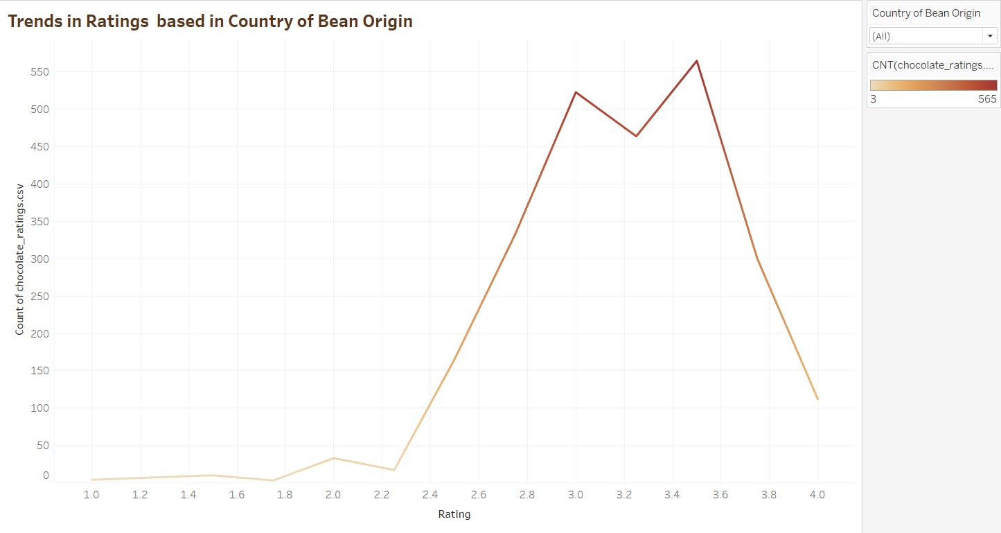
In order to make this line chart, I took the Rating attribute as columns and the count of records as rows.
Then I added a dropdown filter for the Country of Bean Origin so that the graph is adjusted accordingly whenever I choose a particular country.
Assessing the Cocoa Percentages based on the Country of Bean Origin:

To create this line chart, I took the Cocoa Percentage attribute as columns and count of records as rows.
Then I added a dropdown filter for the Country of Bean Origin so that the graph is adjusted accordingly whenever I choose a particular country.
Dashboard:
To combine all the graphs pertaining to the countries involved in the chocolate industry, I have created the following dashboard:

Inferences from the Dashboard:
USA is the most popular company location.
Venezuela and Peru, followed by Ecuador are the most prominent countries in bean origin.
Analyzing the Contents of Chocolates:
Top 5 Most Popular Ingredients:

To make this bar chart, I took the Ingredients attribute as columns and count of records as rows.
Then I created a filter for the Top 5 ingredients based on the count of records.
Analyzing the Average Rating of Ingredients:
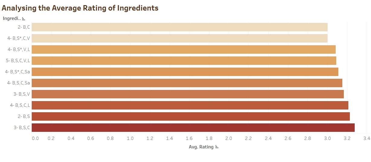
I took the average rating as columns and the ingredients as rows. Then I created a filter for the top 10 ingredients having the highest averages to declutter the graph.
Top 10 Most Memorable Characteristics of Chocolates:
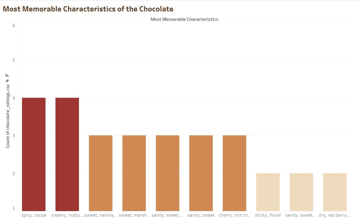
In order to make this graph, I took the count of records as rows and the "Most Memorable Characteristics" attribute as columns.
Then I applied a filter on the characteristics attribute to obtain the top 10 characteristics.
Total Number of Ingredients Considered:

To obtain this metric, I took the distinct count of ingredients as "Text".
Total Number of Chocolate Characteristics:

To obtain this metric, I took the distinct count of "Most Memorable Characteristics" attribute as "Text".
Dashboard:
To combine all the information pertaining to the contents of chocolates in a single place, I have made the following dashboard:

Inferences from the Dashboard:
3-B,S,C is the most popular ingredient in chocolates.
3-B,S,C has the highest average rating among all other ingredients.
"spicy, cocoa" and "creamy, nutty, cocoa" are the most memorable characteristics of chocolates.
Found this article interesting? Give it a like and share it with your friends !!
#data #datascience #dataanalysis #dataanalytics #datavisualization #visual #graph #chocolate #chocolaterating #ingredients #country #cocoa #graphs #dashboard#dashboards #tableau #barchart #bubblechart #metrics #linechart #filters